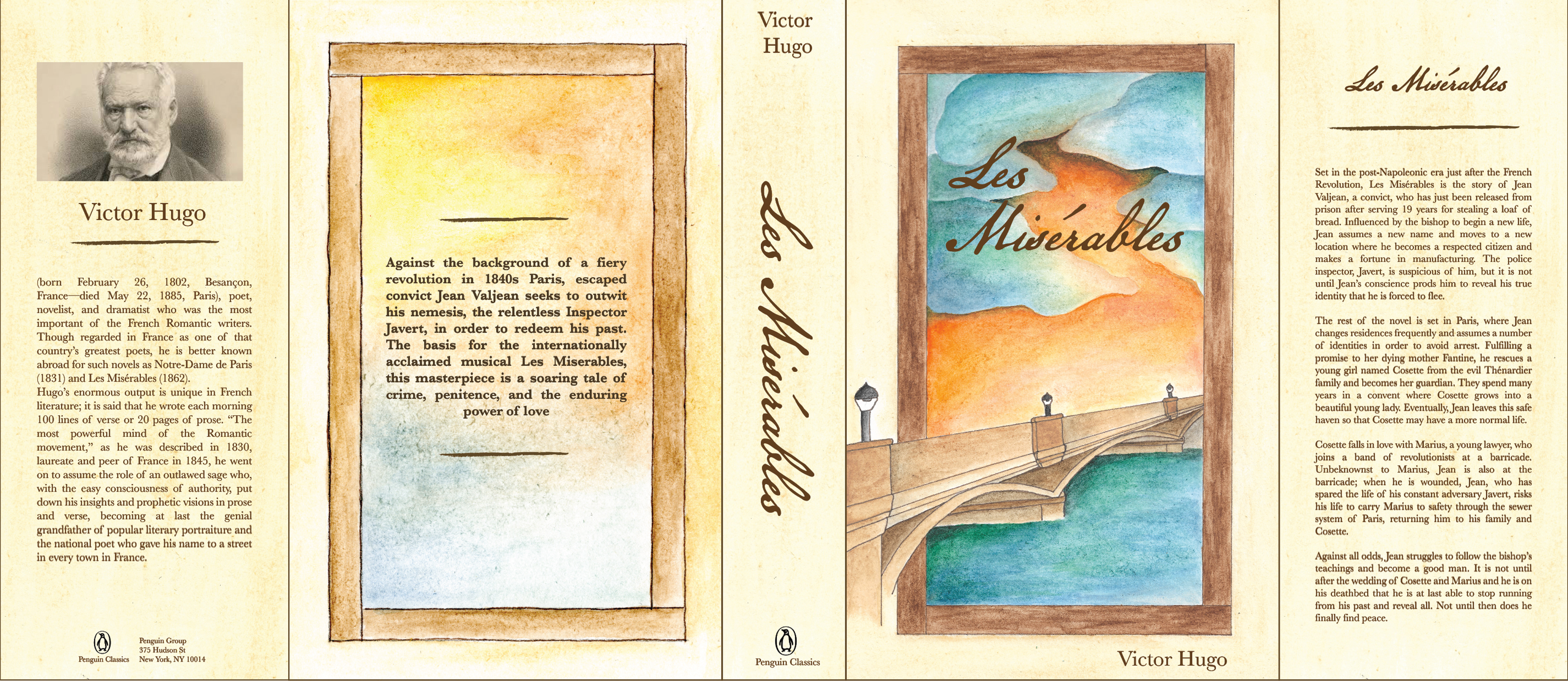
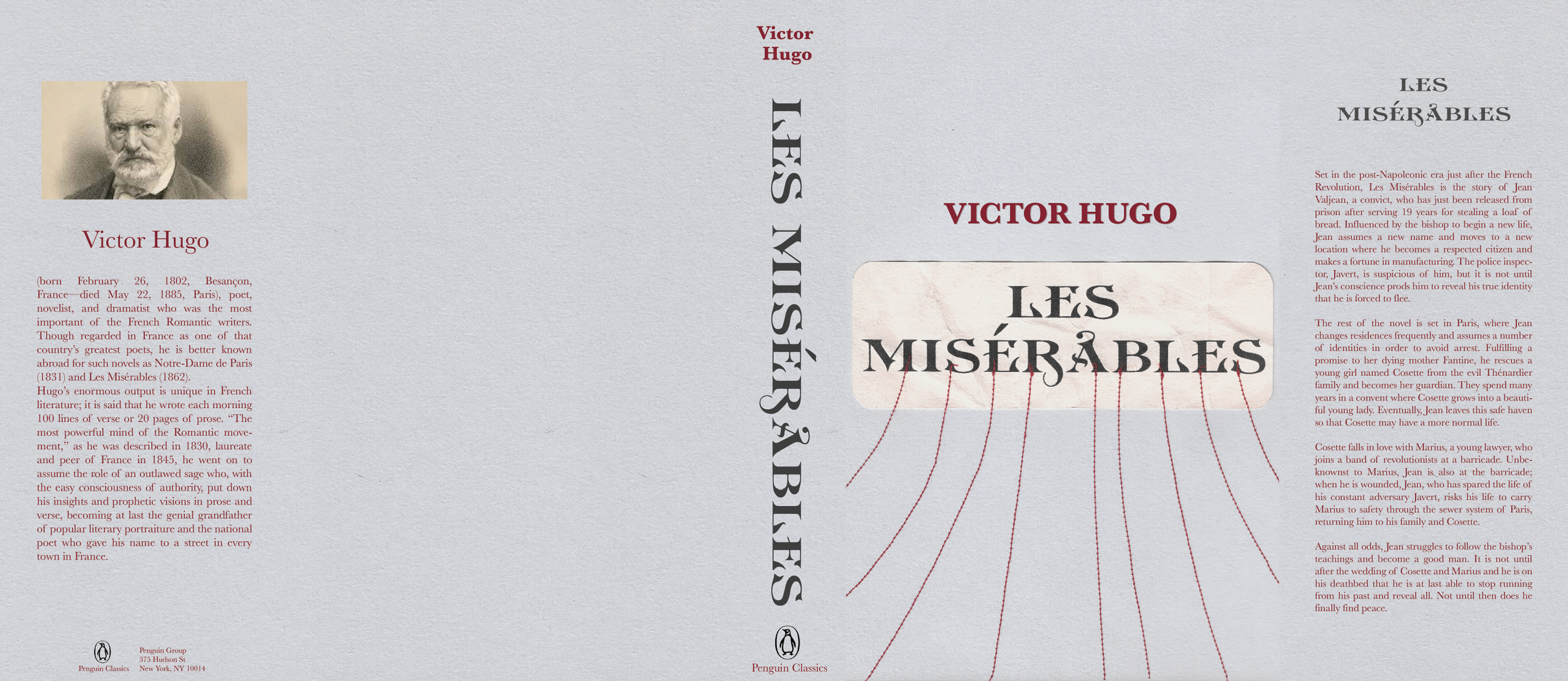
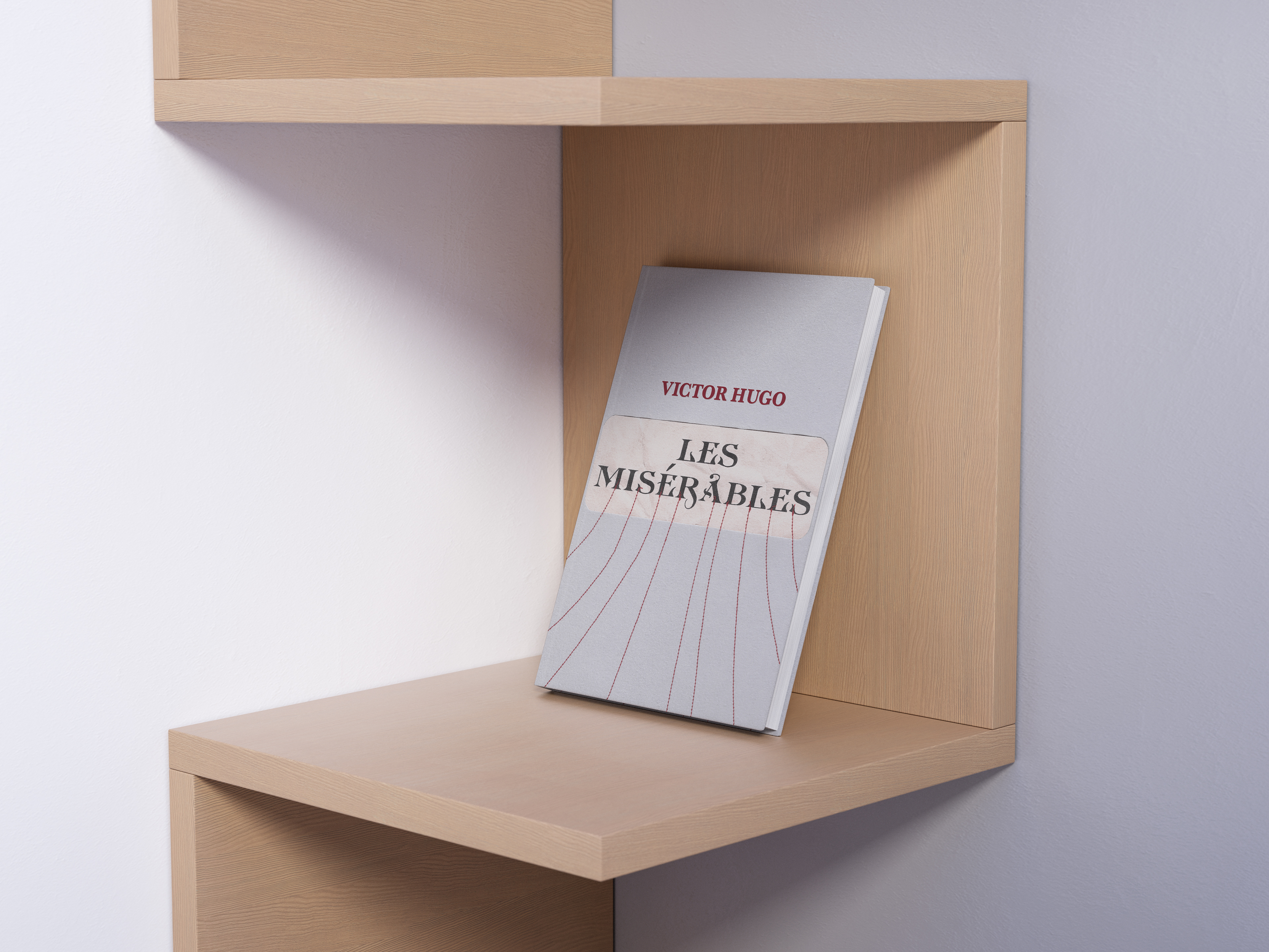
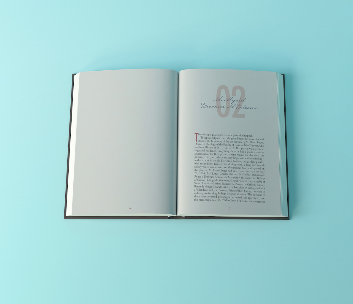
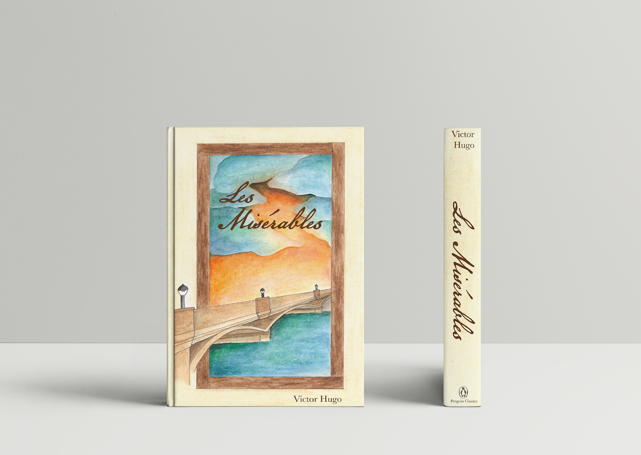
In my Advanced Typography class I created two jacket sleeves and interior design spreads for Les Misérables. For my first jacket I wanted to create a bit of a three-dimensional look to it, so I printed the title, crumpled it, and sewed it onto the background paper. I used red thread to symbolize the deaths that take place throughout the book. On the second book jacket I painted a watercolor illustration to create a more somber mood for the book. I used the bridge as focal point since it symbolized beginnings and ends to some key characters. Bodoni is used for the main body text to add a bit of time period accuracy, and it's one of my favorite serif fonts as well.
